Experience the power of Luzmo. Talk to our product experts for a guided demo or get your hands dirty with a free 10-day trial.


June 7, 2023
Mile Zivkovic
Power BI and Tableau are two commonly used tools for building SaaS dashboards. But which is better? Find out in this Power BI vs Tableau showdown.
To succeed in today’s competitive market, a SaaS product needs to have a wide variety of features. Besides an amazing user experience, onboarding, and customer experience, there is an increased need to have all the right features to make your app “sticky”. One of those is an analytics dashboard.
Embedded dashboards give your users insights into how they interact with your product. For example, an email marketing tool could have a dashboard with all the crucial metrics: click-through rates, open rates, bounce rates, etc.
You could build this feature on your own or use off-the-shelf software. Today, we’re going to focus on the second option and give you two BI tools you can choose from: Power BI and Tableau.
Microsoft Power BI is one of the most powerful business intelligence tools in the market and it’s a leader in the big data field for a good reason. It is based on Azure and has supported apps for Windows as well as mobile apps for Android and iOS. It uses a formula language called DAX (Data Analysis Expressions) which helps you work with relational data more easily and efficiently.
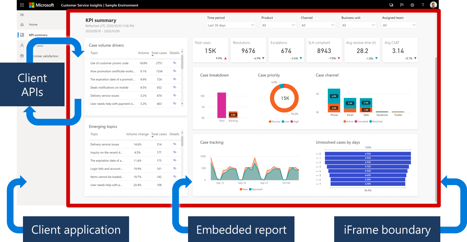
One of the biggest advantages of Power BI is the large volume of data sources (also known as data connectors). The tool can easily plug in to data from Excel, JSON, Azure, XML, SQL, and other file types, as well as online sources such as Facebook and Google Analytics. In the case of online sources, Power BI can pull real-time data to your reports and dashboards.
Moreover, there are many types of visualizations you can use. Bar charts, graphs, maps, gauges, title boxes, and cards - these are all elements you can use in your dashboard. You can also combine multiple visualizations in one dashboard for a more interactive experience and to provide more information for your customers.
You can even pull Python visualizations in Power BI from various data points, which is something your developers will probably look forward to.
Much like Tableau, Power BI is initially designed as a desktop tool to be used on-premise rather than a modern cloud-first SaaS. This means that you’ll do most of the data modeling and preparation in the Power BI desktop tool and then upload everything to the cloud. If you’re used to something more web-based like Google Analytics, this might be a big downside.
Ease of use is another complaint that many users have. It’s important to stress the difference between Power BI and Power BI Embedded here because we’re only interested in the latter. And Power BI Embedded is definitely not built for beginners.
It’s slow, clunky, and does not handle large amounts of data really well. Getting your dashboards to be properly branded and securing portal access to viewers can be very time-consuming. Even though basic Power BI is technically Excel on steroids, the Embedded product has a few key differences that make it harder to use.
Tableau is a data visualization tool known for its extensive customization capabilities, allowing anyone to create stunning dashboards from various data sources. Launched in 2003 and purchased in 2019 by Salesforce, this analytics tool has been popular with data science professionals, developers, and anyone with a penchant for machine learning and data visualization. It can even be used as a robust project management tool by building Gantt charts.

Whether you want to use it for creating reports from your existing large datasets or connect and visualize your dashboard within a website, Tableau can do it all equally well.
Let’s start with the good sides.
In general, Tableau performs extremely well, whether it’s for creating data visualizations or for embedded use in a product. It can handle millions of data rows at a time without an issue and create stunning visualizations based on that data.
It supports a variety of data sources, including SAP, DB, and Hadoop, making for a clean, informative dashboard - and also facilitating work for your devs. You can use the desktop version of the tool but most SaaS businesses use Tableau Server to host it online.
If you run into a problem, worry not. Tableau is known for its great customer support and they will help you out quickly. If not, there is a vibrant online community that discusses Tableau and you should find most of your questions already asked in some shape or form. So even if you’re not a data analyst, you should find your way around Tableau in one way or another.
Although it has a steep learning curve, the drag-and-drop editor is a pleasant change compared to most other BI tools out there.
The massive customization options and a huge array of visualizations come at a certain price and it’s not just in dollars. The first issue with this tool is that it can be incredibly difficult to use and get started with, especially if you have no background knowledge in development. It gets even worse when you use it for embedded analytics and not just data analysis and custom visualization.
We’ll get to pricing in a second but let’s briefly discuss the price of ownership. The price you pay for Tableau as a product is just a part of the total cost. If you plan to use it to its full potential, you’ll need to train your entire dev team to work with data analytics and visualization since the learning curve is very steep. This adds considerable costs on top of Tableau’s initial pricing.
Another common complaint about this tool is poor versioning. If you want to revert to a previous version of your dashboard in Tableau online, this is not possible.
Last but not least, it’s important to keep in mind that this is primarily a desktop-based tool. You’re essentially purchasing Tableau Desktop as a product and a license to Tableau Cloud. If you’re looking for something that’s less dependent on hardware, it’s best to look elsewhere.
Power BI seems to have a pretty easy-to-understand pricing at first glance. However, that’s only if you’re looking at the business intelligence and data visualization side. There is a completely different pricing scheme for embedded analytics.
There are two ways you can get PowerBI, but it’s much more complex than that. To get your accurate pricing, you need to choose your location and the number of virtual cores you’re going to be using. The more cores you use, the more memory you’re going to use too, and naturally, the higher the pricing.
So, the basic example says $1.0081/hour or $735.913/month. This is the price for one virtual core and 3GB of RAM. The price of $735 per month is charged only if your one instance (dashboard) is active and used the entire time for the month, 24 hours a day for 31 days.
In short, the minimum you’re going to pay is around $730 per month with Power BI. However, it’s wise to do your own math and use their embedded capacity planning page to discover your actual costs.
Tableau seems to be easier to understand when it comes to pricing. However, it also has a different pricing stack for Tableau Creator (data analysis and visualization) and embedded analytics. Naturally, the embedded functionality is more expensive.
Just how much? We don’t know and you have to reach out to sales with your specific needs to get a personalized quote. We’ve scoured the highs and lows of the internet but found no public mention of Tableau’s pricing, so you really have to get in touch to get information on that.
Both tools are very capable but Power BI has a slight upper hand. It’s one of the best Microsoft products and it’s simply faster and has a better user interface compared to Tableau. In general, we would give it a small advantage over Tableau.
However, both tools are clunky, difficult to use, targeted toward desktop users, have extremely complex pricing models, and do better with standalone reports than with embedded analytics.
In short, if you have a lot of time for learning and you’re not looking for something to embed into your product, either will work fine. But there is a third, better option.
Creating and embedding analytics dashboards into your SaaS product should not be rocket science. While both Power BI and Tableau are comprehensive and powerful tools, you probably want something more user friendly - and that’s where Luzmo comes in.

With our tool, you can create stunning dashboards and add them to your product not in weeks or months but in days or even hours. We also have very transparent pricing and you’ll know exactly how much you pay and what you get.
Ready to add an analytics dashboard to your app? Sign up for your free trial today!
Experience the power of Luzmo. Talk to our product experts for a guided demo or get your hands dirty with a free 10-day trial.


